Color Palettes That Will Dominate This Year
The most compelling colour palettes build an atmosphere before making a statement. Explore combinations that feel balanced, modern and personal.
The most compelling colour palettes build an atmosphere before making a statement. Explore combinations that feel balanced, modern and personal.
Layer warm neutrals
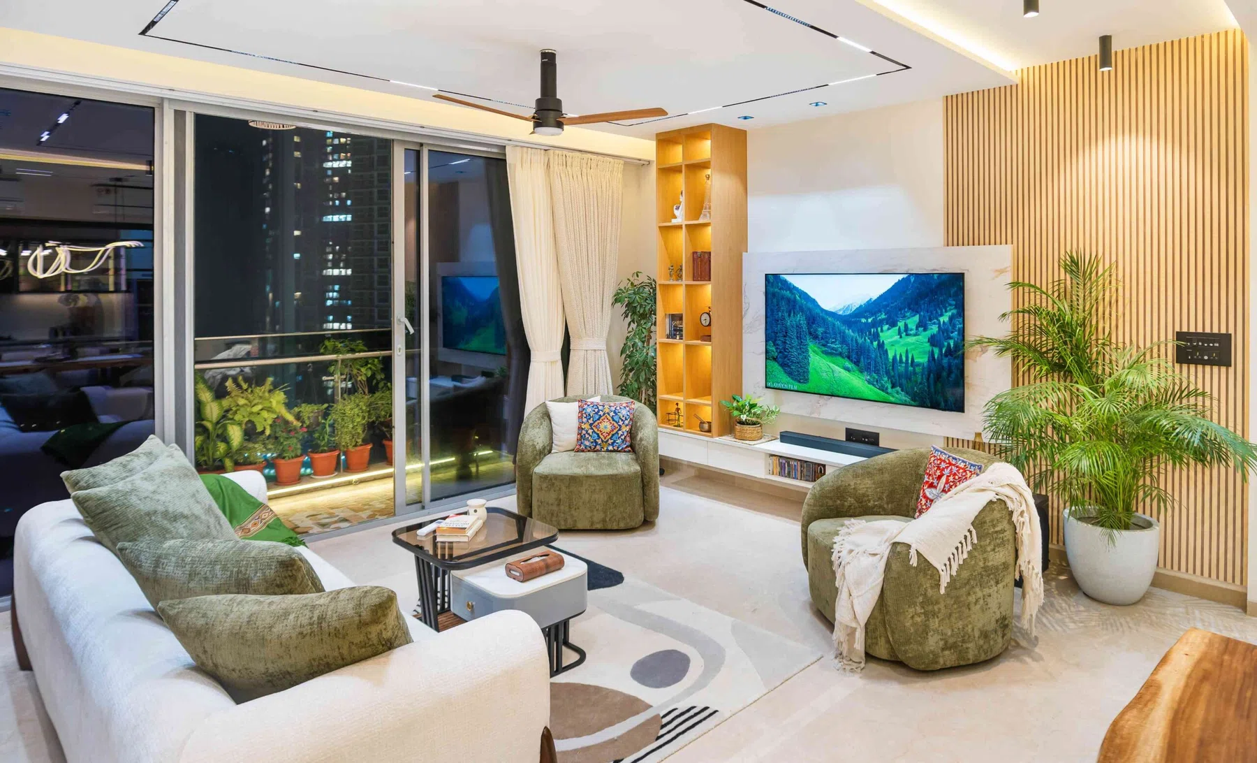
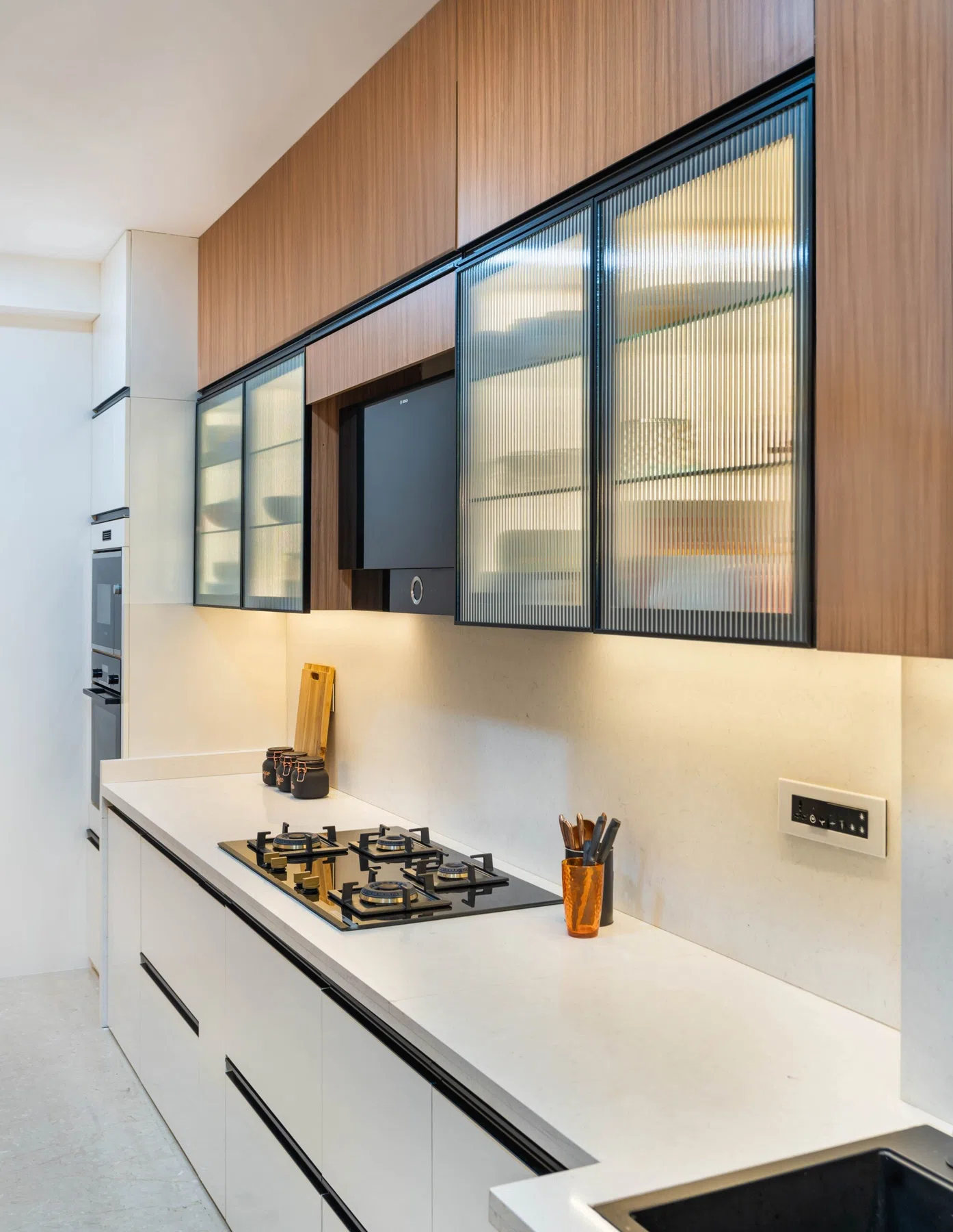
Stone, oat, cream and warm taupe form a gentle base for spaces that need to feel calm. Different textures within the same colour family create depth without adding visual noise.
Introduce contrast through timber grains, black hardware or a carefully chosen artwork.
Bring in muted greens
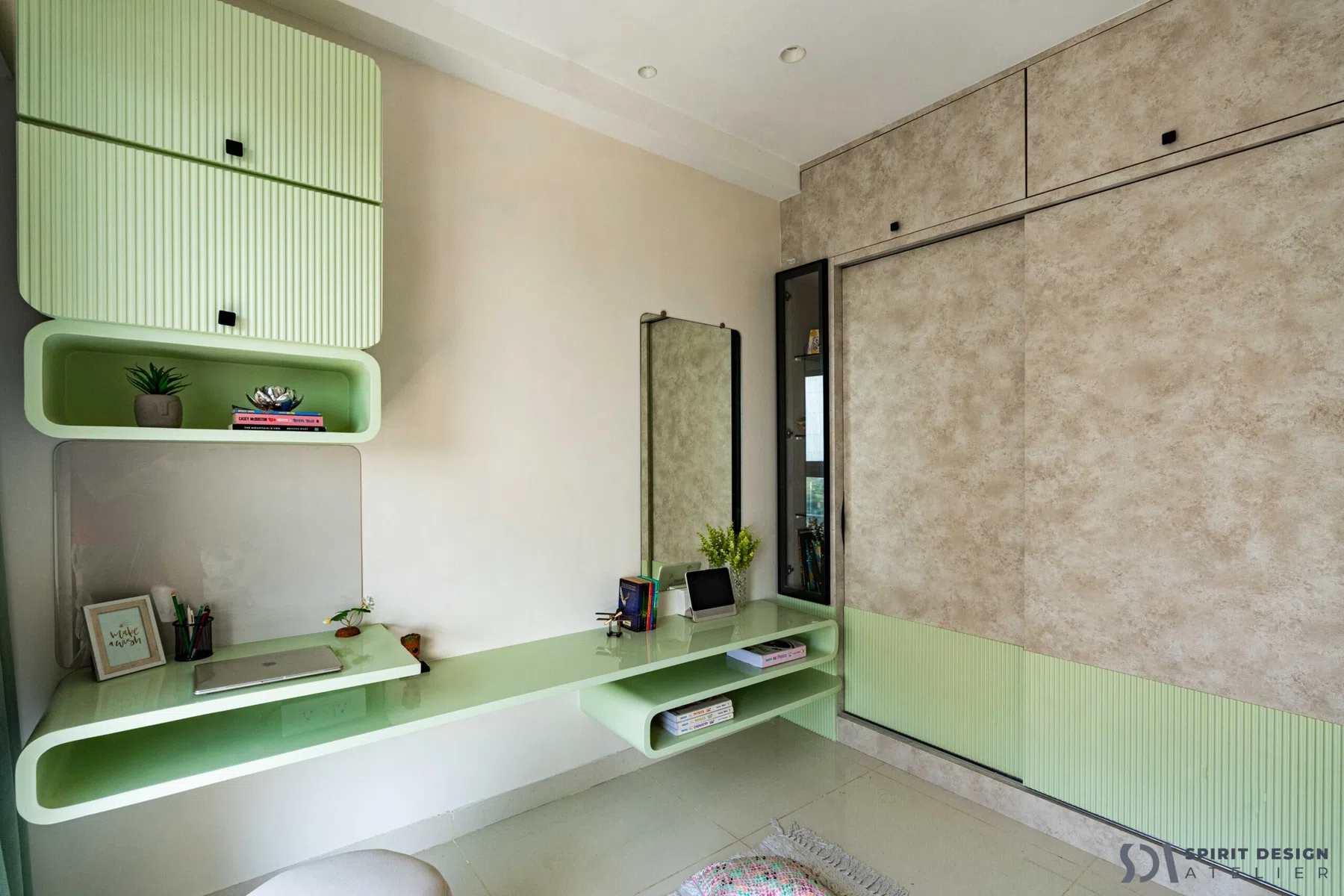
Olive, sage and moss-inspired hues pair naturally with wood, brass and soft stone. These colours can work as accent walls, upholstered pieces or cabinetry in the right light.
Test samples in daylight and evening light before committing to large surfaces.
Use deeper accents thoughtfully
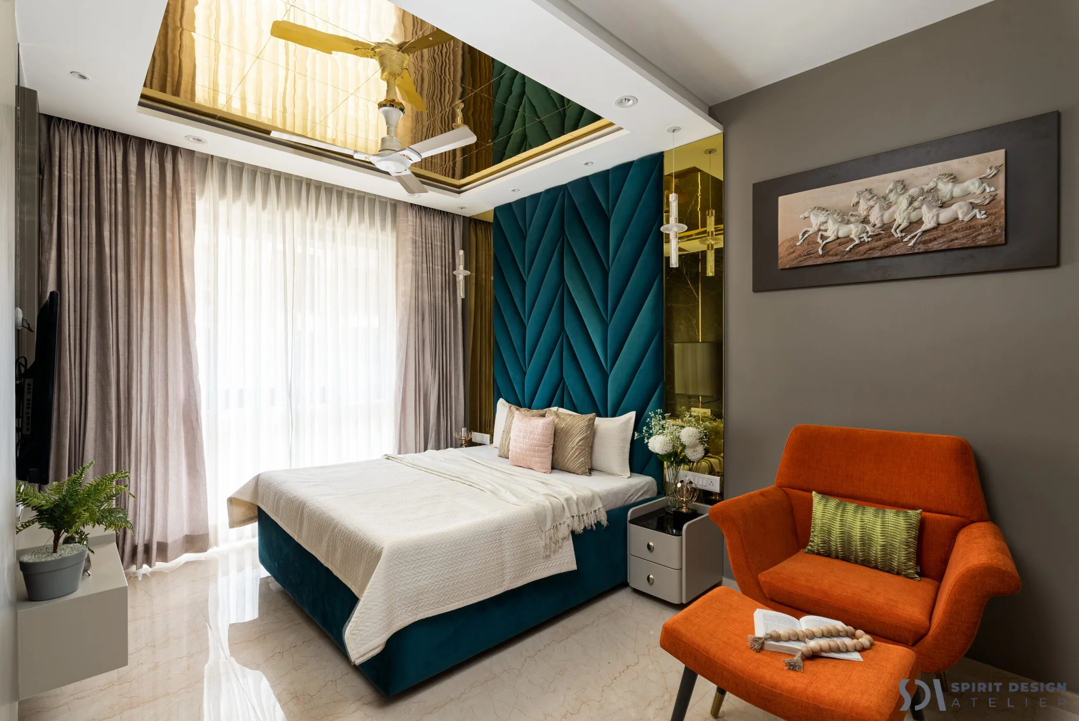
Burgundy, terracotta, chocolate and muted blue offer richness when grounded by lighter surrounding finishes. One confident statement can do more than many scattered pops of colour.
Repeat the accent discreetly in two or three details to tie the room together.
Follow the light
Paint and fabric change character throughout the day. Study the natural light, flooring tone and room size before selecting a final palette.
The right colour is the one that makes a specific space feel better to live in.
Beautiful interiors are personal. The right answer balances aesthetics, daily routines and material choices rather than following a formula.
Let's plan your space ↗